
Chevreul and Blanc’s Laws of Simultaneous Color Contrast and Their Limits
- Art d'Histoire
- May 28
- 5 min read

How did the publications of Chevreul and Blanc revolutionise the work of painters?
The tendency, since the 1860s, and particularly since the Impressionists, has been toward what is termed "light painting" and the work of colourists; the school of line is in decline.
To achieve this, one had to master colour laws, either by instinct—as was the case with Eugène Delacroix—or through science. An entire segment of these laws had been articulated by Michel Eugène Chevreul as early as 1839, but they were only popularised around 1867 by Charles Blanc with the publication of his Grammaire des arts du dessin.
What exactly did this entail? A return to the sources is all the more important given that a portion of their research is not entirely accurate.
From Optical Science to Painter’s Manuals
Jean-Henri Hassenfratz and the artist Charles Bourgeois had initiated the first reflections on complementary hues, but it is to the chemist and director of the Gobelins Tapestry Works, Michel-Eugène Chevreul, that we owe the first major expositions of the chromatic laws of contrasts, following a noted presentation before the Academy of Sciences in April 1828.
However, wishing to prioritise his oral teaching, the scientist restricted the dissemination of his initial observations before finally releasing, in 1839, his encyclopedic treatise of over seven hundred pages, bearing the four-line title De la loi du contraste simultané des couleurs […].
The work analyses and establishes the behavioural laws of colours and their chromatic influence on their surroundings, across very diverse practical fields ranging from easel painting to tapestry, by way of horticulture and decoration.
This corpus met with significant success within the painting community, although most had not read the treatise itself but rather its highly popular, popularised version: La Grammaire des arts du dessin by Charles Blanc, a major figure in the Fine Arts administration under Napoleon III.
The Law of Simultaneous Contrast: A Mechanics of Perception
The central tenet of Chevreul’s theory rests on the principle of the mutual interaction of hues, not in the case of physical mixing—which was already known (blue oil mixed with yellow oil produces green oil)—but also when they are juxtaposed. This is something a painter of genius like Delacroix had explored intuitively, but which was now taught according to well-established rules.

.
Concretely, every painted surface projects a nuance onto its immediate vicinity—not of itself, but of its complementary hue, inducing a kind of permanent colour-bleeding phenomenon: blue adjacent to yellow will cover that yellow with its complementary, orange, and conversely, yellow will push its complementary onto the blue, a violet. To properly juxtapose their tones, all studios possessed Chevreul’s circle, where tones appear with their complementary ones located diametrically opposite on the wheel.
Let us examine this in more detail.

A yellow circle perceived in isolation appears to be adorned with an imaginary violet halo when observed closely—a retinal phenomenon.
Similarly, an orange shape generates a blue border, while a pink object is nimbed with a subtle green.
Applying this principle to the canvas means that a deposited colour invariably colours the contiguous space with its complementary colour.
Consequently, two hues opposite each other on Chevreul’s circle, placed side by side, mutually exalt and intensify one another thanks to this double projection: the orange receives an orange halo sent by the adjacent blue and vice versa.
They are, as it were, doubly pigmented: first by the applied pigment, and then by the projected halo.
The Confusion Between Light-Mixing and Matter-Mixing
Following Chevreul, Charles Blanc classified pigments into three primary nuances, which he also called primitive or generative: yellow, red, and blue; their respective mixtures give rise to binary or complementary hues: orange, purple, and green.
So far, no error. Except they believed these were the primary colours even when dealing with coloured lights... The primary colours of light beams are actually green, blue, red, and yellow; yellow has no place there.
This confusion led to erroneous deductions regarding chromatic cancellations or additions.
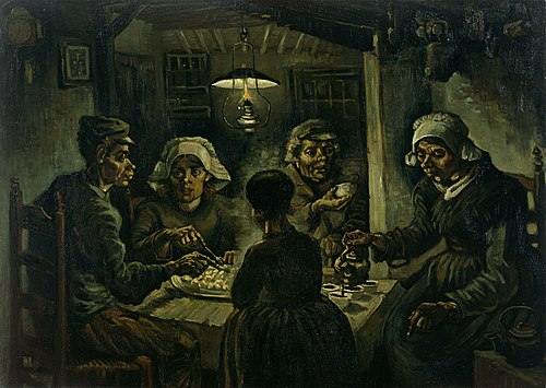
The physical mixing of complementary nuances leads to their neutralisation, forming a gray or broken tones—a technique adopted by Van Gogh as an apprentice colourist, which would lead to his Potato Eaters. This phenomenon corresponds to subtractive synthesis.
Seeking to justify the phenomenon, Charles Blanc erroneously resorted to the term "achromatism." He imagined that an equal superposition of yellow, red, and blue liquids, traversed by a solar ray, would produce perfectly colourless light, even though dyers and painters observed that their pigment mixtures resulted in a dull gray.
Painters would derive a golden rule from this: the juxtaposition of complementaries awakens tones; their mixing is a fight to the death.
For while a white light beam is indeed produced by the conjunction of three primary lights—red, green, and blue—red, yellow, and blue tones are the primary pigment colours, and their mixing produces black through an absorption phenomenon.
One would have to wait for the subsequent work of physicists such as Hermann von Helmholtz and Thomas Young—whose conclusions would be taken up by Ogden N. Rood and read by Georges Seurat—to partially dispel this error.
The Modulation of Values: The Optical Influence of Neutral Tones
Beyond the interaction of pure colours, Chevreul’s research and, consequently, Blanc’s texts examined the influence of values—that is, the scale of lightness.
The juxtaposition of different tones creates an illusion of contrast: the lighter colour lowers its tone to appear even more luminous, while the dark nuance rises to appear more tenebrous.
The integration of white or black surfaces in immediate proximity to a colour also modifies visual perception.
White acts as an optical fixative for its surroundings; it fictitiously captures the clarity of the adjacent colour, giving the eye the illusion that the latter’s pigment is chemically more concentrated, which mechanically raises its tone.
Conversely, proximity to black lowers the vividness of a neighbouring colour and visually impoverishes it.
Furthermore, by virtue of the law of simultaneous contrast, a flat black area (and the same for white) does not retain its neutrality; it is enriched with a semi-transparent optical layer corresponding to the complementary colour of the nuance with which it is juxtaposed. Seurat would know how to play with this, and Fénéon would know how to describe the phenomenon point by point.
Painting studios thus taught how to support, fortify, or soothe a hue without even physically touching it, by acting exclusively on the nuances surrounding it.
The Impressionists and the colourists who followed, including Seurat, Gauguin, and Van Gogh, mastered these laws with varying degrees of perfection. Vincent van Gogh, ever pragmatic, who would become fascinated in 1884-1885 in Nuenen by Blanc’s books—far from any museum or painting—experimented with these theories by mixing his own strands of wool, he who, like Chevreul, lived among weavers.
This blog relies on the primary source anthology sheets provided by Art d’Histoire Académie:
Plus all those inserted as links in the blog above
You can also view our traditional, free-access videos:
The Art d’Histoire Académie platform specialises in primary sources and digitised archives covering the artistic period from 1850 to 1910.
It offers clear, structured interactive videos accompanied by a library of over a thousand anthology sheets, comprising 10,000 explained and contextualised primary sources that can be viewed in their original format.
Whether you are preparing for an exam, a lecture, a guided tour, a conference, an exhibition, or a publication, Art d’Histoire Académie is here to support you. The labyrinth of archives simply becomes what it ought to be for any passionate researcher: a source of inspiration and a space for fulfilment.


